Things you must know before using Appreneur
Traditional data analysis platforms provide user analyses with data at the user level. Appreneur focuses on pattern analyses based on the device rather than by a user. This is because one user can utilize multiple devices and one device can be used across multiple people. In order to accurately portray user analyses and user device information, it is necessary for us to point out the differences between a user and a device. Accurate user device analytics are the fundamental building blocks of a successful app business. Without this information, uninformed business decisions based on guesstimates and incorrect judgments will be unavoidable. Appreneur solves this problem by utilizing AI bots to continuously create and reiterate device pattern algorithms based on user device behavior. The result is a comprehensive back-end data solution that provides extremely precise user device insights that may be used to spark growth within your business.
Easily Misinterpreted Data Classifications
- Gender and Age data will often display as “unset” within Appreneur. This is mainly due to the following reasons: 1) most users do not store age and gender data on their device and 2) Appreneur SDK is not able to access the data through the Appreneur APIs.
- Device names are displayed as string characters because of the same reasons above. e extract a unique system ID (key) information for each device as an alternative.
- Appreneur platform collects and analyzes data based on user device behavior. Appreneur will practically always refer to devices instead of the user, except when referring to user information specifically (such as referring to user profiles in the user segmentation menu). This is because user segmentation menus derive their information from CRM data, so regardless we need to refer to users in these scenarios. Through the integration of the Appreneur SDK, you are able to match the device name to an account id when a user signs up. After you create this mapping, you can associate any user account id data with the applicable device going forward.
Realtime
Data is output based on present information with the most recent 30 minutes displayed on the Appreneur dashboard. This data is updated every 2 minutes after being analyzed within the system.
Overview
Displays the number of total active devices and total number of errors in real time. The graph displays data in 15 second intervals with updates every 30 seconds. You can select up to three out of the eleven fields to display on the chart.
- Device Explorer : To further investigate data (country, OS, app version etc.) on devices that were active in the last 30 minutes, navigate through the Device Explorer and select the criteria you would like to drill down into.
- Active Devices : List of active devices within the past 30 minutes.
Location
When you view the live board, there will be two different tables (or layouts) available. The map shows the countries of origin and the number of languages available within your active users base. User category / device counts are unveiled by hovering your mouse directly over the shaded region.
- Country Breakdown : The second table directly below the map will provide additional data at the country level. For each country the total number of active devices along with the user device category, total error count, total event count, and total form view count is displayed.
- User Devices Table : The last table displays the complete device list of your user base. This shows all information related to your user’s device profile such as their session count, country, language, OS, etc.
Form & Event
This section displays all of the sessions, form views, events, and revenue events in real time. In other words, this dash is a live (Correctly “Realtime”) feed for all of your current user behavior.
- Form & Event Category : To analyze user behavior even further, Appreneur shows the event type and total number of events that are occurring within each OS and app version.
- User Flow : Real time user behavior data that visualizes how events and forms are interconnected within your app.
Acquisition
This dashboard segments all of your users devices into various user device categories in real time. Are the users on your app right now Active, New Install, Returning, or Engaged? This section will provide that information plus demographic data for each user device category.
- Current Session : The last table displays the complete device list of your user base. This shows all information related to your user’s device profile such as their session count, country, language, OS, etc.
Performance
We realize stable app performance is absolutely critical to retaining your users. To address this need we included a dashboard that displays all of the crashes and exceptions that have occurred in your app. Appreneur provides you with the ability to view all pertinent error information within your app (OS, app version, the number of errors, etc.).
- Exceptions & Crashes : The exception and crash list displays the type of error that has occurred by OS and App version.
- Device Error List : The device error list shows every single device on which an error has occurred.
Acquisition
Mobile app users are generally divided between Active, Returning, and Uninstall user categories. However, in reality, mobile app user patterns are dynamic in nature and these 3 categories are not sufficient. An app business’s success cannot be merely attributed to “Active” user activity. Unlike other app analytic services, Appreneur expands upon these user categories unto 9 different user device categories. These specific and detailed device category definitions help ensure app owners get a clear picture of exactly what device segments are contributing to their overall app success. The definitions are as follows:
- New Install Devices : The first time a new user device installs. This is a unique count across a device’s lifetime.
- Uninstall Devices : An user that has deleted or removed the app from a device. Re-installs are not included in this number by default because reinstalled devices are considered “Returning”. Returning devices may be included in this count depending on your preference.
- Active Devices : User devices that use the app more than once. For example if a user device uses an app twice during the month, this device is considered an active user device.
- Returning Devices : User devices that have re-installed the app after having uninstalled in the past.
- Engaged Devices : User devices that display higher than average usage activity. Appreneur automatically calculates user device activity scores based on session count, form views, event count, retention duration, revenue, and so forth. User devices with a score higher greater than 75% of the overall device population are considered to be Engaged users. The Engaged user conditions can be customized within the Engaged menu.
- Retention Devices : User devices that continuously use the app for more than 2 days
- Paid Devices : Revenue bearing user devices. These are devices with any revenue event having occurred within their lifetime.
- 30D+ Dormant Devices : User devices that have not uninstalled however been inactive within the app for 31 days or more.
- 30D+ Reactivated Devices : User devices that used the app after having been dormant. These users have not re-installed the app but have been previously inactive for over 30 days.
All user devices can be thoroughly understood through these 9 device categories. Precisely segmenting these device categories allows you to tailor your marketing strategy to target specific users and correctly attribute the type of user to specific revenue figures. When available, pay special attention to category retention rates by cohort. With the goal of converting more devices to Engaged, various product initiatives to improve these rates may be measured by utilizing these cohort charts.
Overview
The overview section provides a cumulative view of all devices, active devices, inactive devices, and uninstall devices since the first day Appreneur began collecting data in the app. For each one of these categories the device demographics (Country, OS, Age, Gender) can be displayed by clicking on the respective category.
- All Devices : Total unique count of all devices that have used the app. Every device that is currently using or has used the app will be included in this number. This is the total device count that Appreneur uses to calculate the Appreneur service fee. Thus, you can rest assured that every device in this number has been analyzed as part of the service whether considered as uninstall or dormant.
- Active Devices : User devices that have used the app within the past 30 days. These devices do not include Dormant and Uninstall devices however, Retention, Reactivate, and Engaged devices are included.
- Inactive Devices : User devices that have not uninstalled however been inactive within the app for 30 days or more from the date you view the menu. It is included the Dormant user devices.
- Uninstall Devices : User devices that has deleted or removed the app from a device. Re-installs are not included in this number by default because reinstalled devices are considered “Returning”.
- Category Opposites
Based on the calendar dates specified, the total unique device count is compared across certain category opposites. This view highlights specific category strengths and deficiencies. Adjust the calendar date parameters as desired to monitor exactly how the category populations change over time. The comparisons below will provide the following insights based on the date parameters set:
- All Devices with Returning / Uninstall : To understand the % of users leaving your app
- New Install / Returning : To spend more on promotional or reactivation marketing.
- Engaged / Non Engaged : To identify the ratio of loyal/engaged users within the app
- Paid / Non Paid : To assist with setting revenue goals by viewing the % ratio of revenue bearing devices
- 30 Day+ dormant / 30 Day+ Reactivated : To identify the ratio of devices that return to the app after having been dormant
The New Install user devices are able to include the Returning user devices since a certain device goes the cycle of new install, uninstall, and then reinstall for the time period specified, resulting in the final status of this user device becoming the returning users device.
- Retention Activity
Retention is one of the most important components of the user lifecycle, and should hold a central spot in any mobile marketer’s dashboard. On top of providing an invaluable indication of the quality of an app, retention metrics have a direct impact on the calculation of customer lifetime value (LTV) for freemium apps. In this dashboard, the retention rate gives a number to the percentage of user devices who still use an app a certain number of days during the calendar date periods. It is calculated by counting unique users that trigger at least one session in one day, then dividing this by total user devices within a given cohort.
▣ Full retention
- How it is computed : which proportion of users come back every single day to the app until D+[N].
- Where and why is it used : full retention is extremely restrictive and not so widespread, but it however gives an idea of the level of engagement in the app.
- Day [N] example : only users who come back every single day from Day [0] to Day [N] are considered retained.
▣ Return retention
- How it is computed : which proportion of users come back to the app at least once within D+[N] days.
- Where and why is it used : return retention is often used in gambling as it gives an idea of how many people didn’t drop out after the first open (called retainers), which then also allow to retarget the others.
- Day [N] example : all users who came back at least once before Day [N] are considered retained.
Appreneur presents retention information is this manner to more accurately portray user retention patterns. Most retention information is muddled by devices that do not use the app (such as dormant) and create confusion amongst user behavior. If you have no usage pattern like reservation or ticketing service, there will have low retention, so we at Appreneur believe that these devices have no particular reason to be included in key retention metrics in the first place. All retention metrics can be viewed across various time periods (weekly, monthly) and exported to various formats.
- Demographics
The demographics section is based on the date parameters, so please ensure that the appropriate dates are specified above. This chart displays the general demographic information for each one of the device categories along with total device counts
New Install Devices
For the calendar date periods specified, the following data will be output:
- Map Data
All new installs are shown by major geographical region. User category / device counts are unveiled by hovering your mouse directly over the shaded region.
- New Installs vs Returning + Peak Chart
New installs and returning installs are plotted over a time series to expose certain install trends within your app. These metrics are important to understand what type of marketing campaign to focus on. High new installs would correlate with normal user acquisition campaigns while a high returning install count would suggest heavy remarketing campaigns. These types of campaigns can be optimized based on the peak chart statistics provided immediately located on the right. Precisely what day, time, and month to target within your campaign is easily defined.
- Activity Stream After First Install
In this dashboard, Appreneur calculates retention based on the first user day (D[N]/D0) rather than the preceding day (D[N]/D[N-1]). This means that for the time period specified, the D2 or D3 retention will always be expressed in relation to D0.
▣ Full retention
- How it is computed : which proportion of users come back every single day to the app until D+[N].
- Where and why is it used : full retention is extremely restrictive and not so widespread, but it however gives an idea of the level of engagement in the app.
- Day [N] example : only users who come back every single day from Day [0] to Day [N] are considered retained.
▣ Return retention
- How it is computed : which proportion of users come back to the app at least once within D+[N] days.
- Where and why is it used : return retention is often used in gambling as it gives an idea of how many people didn’t drop out after the first open (called retainers), which then also allow to retarget the others.
- Day [N] example : all users who came back at least once before Day [N] are considered retained.
This retention activity is presented strictly for new install devices and can be viewed as a number or percentage. The dates can also be easily flipped through by clicking the arrows located at the bottom right corner. All retention metrics can be viewed across various time periods (weekly, monthly) and exported to various formats.
- Referrals
Appreneur is currently working on a referral attribution service. This is currently in the beta stage and is only available to display the counts of new installs for Android and iOS. If you have spent money on advertising then Appreneur will detail the install count received by campaign as one row. It is highly recommended that you check these campaign revenue numbers against the third party advertising reports. Within the mobile ad attribution world there are two main methods for tracking advertising campaigns: through deep links or server redirects. All major attribution companies use these methods to report back to companies on where their ad dollars are effectively spent. This however is not 100% reliable/accurate and fraught with data inconsistencies for various reasons: 1) If no partnerships are established, ad attribution is not possible however 2) There are an assortment of advertising companies that offer compelling incentives to use their service and 3) iOS if the system policy is changed then all of these advertising capabilities can be blocked. Knowing these data challenges exists, Appreneur does provides data through the following methods:
- iOS application : The best way to accurately track referral information is through iTunes Connect. Appreneur downloads iTunes Connect data if you provide your app store credentials in the Appreneur console. Simply click the Setup Referrals from iTunes button and fill out each field. You must keep this connection live to continue receiving accurate referral information.
- Android application : Google’s methodology for tracking advertising campaigns incorporates the use of a UTM tag defined by the user. Appreneur utilizes this UTM tracking method to attribute data back to a campaign. Note that UTM tracking is not limited to just ad campaign tracking -- it can be used to track data across any URL tag.
Please refer below to implement the usage of UTM tags: You can add parameters (such as utm_source, utm_medium, and utm_campaign) to a URL to capture reporting data about the referring campaign. For example, the following link would allow you to identify the traffic to example.com that came from a particular email newsletter, as part of a particular campaign: https://example.com?utm_source=news4&utm_medium=email&utm_campaign=spring-summer You can create your URLs by hand or you can use a URL generator in here. There are three generators. Be sure to use the correct URL generator because the URLs to websites, the Google Play Store, and the Apple App Store are each a little different from each other.
There are 4 different referral sources:
- Unset : Referrals that cannot be tracked
- App Store : Referrals directly from searching through an app store (such as Google-play_organic)
- Advertisement : Referrals from an ad campaign. The Ad Campaign Name will be displayed.
- SEO or Web URL : Referrals from external URLs or search engines (will display in formats such as APPU or pcampaign)
Uninstall Devices
During the process of implementing a successful strategy to retain users within the app, a company must identify exactly why users are uninstalling in the first place. Appreneur allows you to pinpoint uninstall trends during the date calendar period specified. The total number of device uninstalls are visualized over a time series along with overall uninstall metrics within the app. The uninstall visualizations can also be switched to view uninstall patterns and uninstall reasons by clicking the top right drop down menu. By default Appreneur does not include devices that have reinstalled the app however, these devices may be included by clicking the “include returning” toggle button. Please note that Appreneur requires a minimum of 3 months of device activity data to provide any reliable uninstall pattern information. This is because user behavior can drastically change during a shorter period (devices may uninstall then reinstall, etc.) and the overall user device journey should be assessed as a whole. Certain situations would require uninstall patterns in a shorter time frame. To speed up the uninstall pattern matching process and reduce analysis time, please share push notification permissions with Appreneur. This will allow Appreneur to check user install status in real time by sending silent pushes to user devices on a daily basis.
For the calendar date periods specified the following metrics will be displayed:
- Uninstall Devices : The total unique count of uninstalled devices
- Avg Sessions : The average session count of uninstalled devices
- Avg Session Duration : The average session duration (length of time) of uninstalled devices
- Avg Form Views : The average number of forms (screens) viewed per uninstalled device
* Avg. Sessions, Duration and Form Views fields until uninstall : The counts have been calculated from installed time to uninstalled time.
A healthy mobile app business would maintain low uninstall metrics across these 4 categories. This would also suggest that marketing efforts should be focused on acquiring new users. On the other hand if these metrics are high, then there are many dissatisfied users that are having a negative experience within the app. A high spike in uninstall metrics would likely correlate with a app product problem and any effort to retain users should be immediately executed. Appreneur highly recommends reviewing the Uninstall Pattern, Uninstall Reason, and Uninstall Device Demographic visualizations to help mitigate high uninstall counts.
- Uninstall Devices List
A complete list of devices that have uninstalled during the selected time period are available to export. Most importantly, this uninstall information will tell you exactly how much revenue these devices had generated (lifetime) and the last known status of the device. If a majority of these Uninstall Devices were Engaged Users this would mean the app has lost out on future revenue and diminished overall app loyalty.
Returning Devices
Devices that reinstalled the app after having previously uninstalled. There are various reasons that would cause a device to repeatedly uninstall and reinstall an app, from not having enough storage space to having factory reset the phone. Appreneur realizes that not all of these Returning devices are of equal value and segregates the Returning devices among three major categories:
- Confirmed Engaged Devices : Devices that were Engaged devices prior to uninstalling AND displayed behavior similar to engaged devices after reinstalling.
- Potential Engaged Device : Devices that were almost considered Engaged devices prior to uninstalling AND are Active devices after reinstalling.
- Rarely Engaged Device : Devices that rarely used the app before uninstalling and after reinstalling. These devices usually have installed the app out of curiosity and have the highest risk of being misclassified because of infrequent user activity. For Rarely Engaged Devices it is important to browse through the Rarely Engaged Device List to ensure certain devices are not being incorrectly excluded.
To further investigate within these 3 categories, click directly on the desired box. You will notice that the data output will change based on the box selected. For each category you will be able to see device activity before uninstall and after reinstall across the following dimensions: Engaged / Non Engaged, Revenue, Ad, Avg Form & Events. This will split the overall population by these views and give you a deeper understanding of device user behavior pre and post install. Note that the data displayed will change based on the type of information collected by Appreneur. If revenue and ad information cannot be collected, only Engaged & Non-Engaged and Avg Form & Events information will appear. A complete device list for each category is available to export. Again, within this device list pay special attention to the “Current Status” field. This is the status of the device after reinstalling the app and is the best indicator for which category this device truly belongs to. If an Engaged device is in the Rarely Engaged Category -- then you will know to include this device in your marketing efforts.
Engaged Devices
Appreneur heavily emphasizes Engaged Devices because Engaged users naturally generate the most retention activity. Furthermore a strong successful mobile business is dependent on how many consistent, rather than irregular, users it is able to acquire. Thus, Appreneur strongly believes that the success of the business lies within a thorough analysis of Engaged users. Mobile businesses have a higher chance to thrive if app owners are able to specifically identify which users are Engaged and understand what led them to become Engaged. An Engaged user is defined as a user device with significantly more user activity than the average user. This brings poses the question of how exactly an Engaged user is calculated. First, averages are calculated for all 5 major categories below:
- User Sessions
- Session Duration Time
- Form Views
- Event Counts
- Usage Periods
- Revenue
An engaged user must : 1) have a higher than average score for each category AND 2) have interacted with your app within an n-Day period. HOWEVER, it is possible to customize the definition of an Engaged user by clicking the + button directly below the line graph. Here you can set your own conditions if you do not believe the default conditions are insufficient.
The following information will help guide you in understanding your Engaged Device base:
- Pattern Tracking : App owners may retrieve detailed Engaged user device activity through the Pattern Tracking form located on the top right hand of the screen.
For the specified calendar date period devices are segregated between retention periods for devices that stayed Engaged for longer than 2 days. Based on the date periods set the following data is presented:
- Engaged Devices : The total number of Engaged devices
- 1 Day Engaged : The total number of Engaged Devices divided by the total number of All devices not include uninstalled devices. This rate outlines the percentage of Engaged Devices that have conditions of engagement during the last 1 day period.
- 7 Day Engaged : The total number of Engaged Devices divided by the total number of All devices not include uninstalled devices. This rate outlines the percentage of Engaged Devices that have conditions of engagement during the last 7 days period.
- 14 Day Engaged : The total number of Engaged Devices divided by the total number of All devices not include uninstalled devices. This rate outlines the percentage of Engaged Devices that have conditions of engagement during the last 14 days period.
- 30 Day Engaged : The total number of Engaged Devices divided by the total number of All devices not include uninstalled devices. This rate outlines the percentage of Engaged Devices that have conditions of engagement during the last 30 days period.
- Sessions : Total session count for all Engaged Devices
- Paid Devices : Number of devices that have generated revenue
- ARPD : Average revenue per Engaged Device
- Revenue : Total revenue derived from all Engaged Devices
How to Customize the requirements for an Engaged Device As stated above, it is possible to customize the definition of an Engaged user by clicking the directly below the line graph. After entering in a title, input the desired condition values you would like Appreneur to use when assessing Engaged users. A user will be considered as an Engaged User if any of the multiple conditions are met when the “OR” field is selected. If the “OR” field is not selected all conditions must be satisfied in order to consider an Engaged User.
Retention Devices
Appreneur focuses on retention analysis for 2 major device categories: Engaged and Active. Appreneur considers device retention data for these categories only if the device has consecutively used the app on a daily basis (3 days retention would mean the device used the app consecutively 3 days in a row). Each one of these categories can be switched between by clicking the device category located on the top right hand of the screen. After clicking the desired device category, 4 custom retention periods can be defined by clicking the at the top left corner of each box. Along with a total device count, the device details are also displayed by clicking on the box. These device details will outline the number of user devices that have consistently retained over the set retention period along with all device demographics. The device demographics will also display session information for the selected retention period. If this session information displays low user activity behavior, service/content features that increase engagement should be implemented.
▣ Full retention
- How it is computed : which proportion of users come back every single day to the app until D+[N].
- Where and why is it used : full retention is extremely restrictive and not so widespread, but it however gives an idea of the level of engagement in the app.
- Day [N] example : only users who come back every single day from Day [0] to Day [N] are considered retained.
▣ Return retention
- How it is computed : which proportion of users come back to the app at least once within D+[N] days.
- Where and why is it used : return retention is often used in gambling as it gives an idea of how many people didn’t drop out after the first open (called retainers), which then also allow to retarget the others.
- Day [N] example : all users who came back at least once before Day [N] are considered retained.
Each retention period will also output a cohort analysis that graphs device, session, and session duration retention over time. This retention graph is based on the data from the table below, which can output retention data counts or percentages over the specified time period. Each periods total retention percentage is located at the top of the chart and can be exported in XLS, CSV, or PDF formats.
Re-activated / Dormant Devices
Various leaders in the mobile app industry have emphasized the importance of a strong remarketing campaign over acquiring new users. In other words, every mobile app business requires a sound strategy to retain users within their app. Executing upon such a retention strategy however, is much more difficult. Who should be marketed to? How should they be targeted? These key questions often leave management struggling to find an answer -- which is precisely why Appreneur provides specific data over re-active and dormant devices. By definition, Dormant/Reactivated devices are the first device category that should be retargeted when launching remarketing campaigns within the app. Dormant devices may be converted to Reactivated devices by investing in remarketing campaigns, with the end goal of converting all devices to become an Engaged Device. Appreneur provides this device category data in order to specifically provide WHO to target, and HOW to target these users through device behavior analysis. Note that Appreneur defines the Reactivated/Dormant device category in the following manner:
- 30Day+ Reactivated User Device : User devices that have reused the app after having been inactive for a minimum of 31 days.
- 30Day+ Dormant User Device : User devices that have not used the app for a minimum of 31 days.
The Re-activated / Dormant Device dashboard will output the total number of Reactivated / Dormant devices that have been identified during the app’s lifetime. The definition of a Reactivated/Dormant device is set by default to a period of over 31 days. This time period can be increased by greater increments according to the app industry. Specific apps may want to define the Reactivated /Dormant period differently for various reasons. For example, a news app user may interact with the app on a daily basis, in which case it would make sense to define the inactive period as over 31 days. If the app was a hotel app however, a user may only interact with the app every 3 months, so in this case a reasonable inactive time period may be 180 days. The inactive time period requires a judgment decision over what time period is appropriate. Please assess the nature of your app and set this period accordingly.
- Reactivated Metrics
After clicking the Reactivated located at the top right screen, the following 4 metrics will be displayed. All data is displayed for the given inactive period set (30 days, 60 days, etc.).
- Reactivated Rate : The total number of Reactivated Devices divided by the total number of Dormant Devices. This rate outlines the percentage of Dormant Devices that have Reactivated.
- Engaged Rate : The total number of Engaged Devices divided by the total number of Reactivated devices. This rate outlines the percentage of Reactivated Devices that have converted to Engaged Devices.
- Avg Sessions : The average number of sessions of the Reactivated Devices.
- ARPD ($) : The Average Revenue per Device for all Reactivated Devices.
*Session, Revenue Fields After Reactivation: The counts have been calculated after the devices was reactivated time.
You can view Reactivated devices by country by hovering your mouse over the map. This will tell you what location to target your reactivation marketing efforts. A pop up menu will display the country’s metrics and highlight areas with high reactivated and engaged rates. Closely analyze which countries may produce the highest ROI and focus marketing efforts to those areas. The historical count of all Reactivated devices will be automatically output. You can view the total number of Reactivated users that currently remain. If your Reactivated count showed 2 devices and displayed 100 devices after clicking the button, this would mean the following: There were 100 Reactivated devices present over the lifetime of your app and currently 2% of those Reactivated users remain today. It is important to compare the current status to historical numbers to gauge the overall effectiveness of your remarketing strategy. In this scenario only 2 Reactivated users are currently present which means that the other 98 devices uninstalled or became Dormant. By clicking on the device category filter you can view the number devices that became Active, Engaged, and Uninstalled after Reactivating. The device counts shown are not unique and can overlap between statuses -- a device that was Active then Engaged will show up in both device category counts. Start by viewing the total number of Reactivated devices by clicking the “Active” device category (since they are now active). This is your total Reactivated base to compare against. Click on the Engaged or Uninstall categories to compare the number of devices transitioned into Engaged/Uninstall from Reactivated. Finally, the bottom of the page will output a device list you can use to compare the current status of each device. Detailed demographic information for each Reactivated device can be viewed by status. You can see exactly which countries, OS, etc., all Reactivated devices originate from by parsing through this data.
- Dormant Metrics
After clicking Dormant located at the top right screen, the total number of Dormant devices (lifetime) will be displayed. All data is displayed for the given inactive period set (30 days, 60 days, etc.). You can view the total number of Dormant devices which will update all metrics accordingly. Each Dormant device can be seen by country if you hover your mouse over the map. A pop up menu will display the country’s metrics and highlight Dormant and Engaged rates. The Engaged rate here reflects the percentage of devices that were Engaged prior to being dormant. Countries with high Engaged rates are prime for remarketing as they reflect high potential for app activity. Directly below you may click the device category filter to view the number devices that were Active and Engaged before being Dormant. The device counts shown are not unique and can overlap between statuses -- a device that was Active then Engaged will show up in both device category counts. Start by viewing the total number of Dormant devices that were previously Active by selecting the “Active” device category from the drop down menu. This chart will group devices by the length of time they have been Dormant. Repeat this exercise for Engaged and pay special attention to the distribution over time. Finally, the bottom of the page will output a device list you can use to compare the current status of each device. Detailed demographic information for each Dormant device can be viewed by status. You can see exactly which countries, OS, etc., all Dormant devices originate from by parsing through this data.
User Segmentation
There are a few key things to consider when viewing the user segmentation dashboard. All analytic platforms segment users into Active, New Install, and Uninstall categories. Appreneur goes a step further and segments your user base into very distinct user categories such as Engaged, 30 Day+ Reactivated, and 30 Day+ Dormant. For the devices in each user category you can drill into each device profile. These device profiles are similar to the user information sold through other third party app analytics firms. Appreneur provides this information as part of our complete service package. The Marketing Funnel dashboard is also unique because of the numerous filters you may apply. For example, you can specifically filter one part of the funnel by session time or type of revenue received across these devices. The Appreneur even provides the ability to filter by specific forms or events that happens in the device.
Churn Rate
Appreneur monitors churn rate for Active and Engaged devices only. Although churn rate is practically always viewed across total users, within the grand scheme of things users outside of Active/Engaged are irrelevant for a mobile app based business (businesses that do not rely on web services). Pay special attention to the "Peak Curve of Last 30 Day". The shape of this curve should be smooth and flat rather than containing major spikes. A major spike would indicate high churn and instability within your app. A successful mobile app business maintains a low or negative churn rate. If you are constantly seeing positive churn rates (a - sign) then continue to expand with user acquisition however; if negative churn rates are present (a + sign), then focus on reactivation campaigns. The churn rate summary displays average churn rates for the selected time period (1 day, 7 day, etc.) in large font. The small percentage rate is the comparison of the churn rate vs the prior average churn rate. Churn rate is split between active devices and Engaged Devices. When looking at revenue, Appreneur does not consider the churn rate of other user device categories. However, if you notice that the active device churn has drastically increased, this could mean your users have churned from Active to either Dormant or Uninstall device categories. The same goes for Engaged - a significant increase in churn rate for Engaged users means devices are migrating into different user device categories. A healthy, successful business is able to maintain a low or negative ( - ) churn rate. The device growth rate should always exceed the churn rate. Note that the churn rate visualizations require a minimum of 3 months worth of data. If 3 months of data is not collected by Appreneur the churn rate data will be presented however, this information will not be meaningful. This is because the Appreneur SDK takes time to categorize devices (between Active/Engaged/Uninstall/New Install/etc.) and accurately analyze churn rate. Given that monitoring total device Total Installs/Uninstalls numbers is of utmost importance, Appreneur provides these counts based on the date parameters selected. Note that Install numbers are total installs (New Installs + Returning Installs). This information is followed by device churn/revenue detail output by cohort.
User Profile
If no date parameters are selected the complete data history for all devices will be displayed on the dashboard. The date parameters can be selected at the top right corner of the screen.
Please see the following user category definitions below:
- All Devices : Every app device using your app during the specified date period. This is a unique count over the device lifetime. If a device has installed, uninstalled, and reinstalled, the device count would be one.
- Active Devices : Devices that used the app more than once during the specified date period.
- Inactive Devices : Devices that installed but never used the app. These devices never logged in, searched, or performed any action within the app.
- Engaged Devices : Devices that display activity greater than the average of all app device activity. Device activity is averaged for form view, session time, event count, session duration, retention days, etc.
- Returning Devices : Devices that reinstalled after uninstalling in the past.
- New Install Devices : Devices that have installed for the first time.
- Uninstall Devices : Devices that uninstalled the app.
- 30 Day+ Reactivated Device : Devices that have not used the app for 30 days or more but started to use the app again. This does not include New Install or Returning devices.
- 30 Day+ Dormant Devices : Devices that have not used the app for 30 days or more.
Depending on the time period a device may fit into multiple categories. For example, over a 3 month period one device may install (New Install Device) in January, uninstall (Uninstall Device) in February, and reinstall (Returning Device) in March. When looking at device counts from January - March, there would be 1 device count in each user category. However, if we looked only within one month, such as February, the device count will be the most recent user category applicable. In this case, February would show only one uninstall (Uninstall Device) and no New Install or Returning Device would be included. At the very of the end of the dashboard all device profile data is output to one table. You can filter which user category, country, language, OS, etc. you would like to explore by clicking the filter button on the top right. All included devices in these user categories, along with any relevant data for those devices are output and can be exported. The device profile data provides valuable marketing and customer support insights related to your app. Please pay attention to the current status column in this table. The current status field displays what user category the device is defined under and should match the user category being filtered for.
By clicking the device ID a device profile will pop up and display the following information:
- Status : The current user category this device is defined under.
- Last Session : The last calendar date the device used the app.
- Session Duration : The total time the device spent using the app (Lifetime).
- Revenue : The total revenue received from this device (Lifetime revenue).
- OS/App Version/Device Model/Location/Birthday/Gender : Device system information along with any saved information input from the device.
- Referral : The device download referral aka where the download originated from. This field is often unset when Appreneur is unable to track exactly where a download originated from.
- Installs : Total device install count (Lifetime).
- Map Data : Device location data.
- Activity Timeline : All activities base on time that occurred in the app. The date, time, install, uninstall, returning, stating dormant time, reactivation time, paid session, form views, events, revenue items, count, and $ revenue data are included. Through this activity timeline, you can be supported for accounts, claims, contacts, leads opportunities, and activity-enabled custom objects.
- Revenue History : All revenue transactions that occurred in the app. The date, time, item, count, and $ revenue data are included.
- Sessions (Lifetime) : The total number of app sessions that have occurred in the device (Lifetime). For each session all data regarding date, time, app version, session duration, and retention days is provided.
- User Flow : The forms and events this device has viewed in the device’s lifetime.
Marketing Funnel
- Target Funnel : Within Appreneur, there are always 3 segments to the user funnel. These segments filter from the top down (from the 1st target to the 3rd target). Naturally then, the last target will be the smallest group of devices. The devices included within the 1st target are the total user devices in your app. By clicking on the you can select the applicable filters to narrow down your device group. Any filters selected for the 1st target will result in your 2nd target segment. Any filters selected for the 2nd target will result in the final 3rd target group. By filtering through these targets you can understand how many devices are remaining based on select criteria.
Funnel Filtering Recommendation: A Step-by-step Guide
Start by setting the desired date parameters for your funnel. On the right side of the 1st target, click on the to display a list of parameters you filter by.
- 1st Target : Click on the 1st target and select OS, Country, and Gender parameters.
- 2nd Target : Click on the 2nd target select App version, User, and Device Type parameters.
- 3rd Target : Click on the 3rd target and select Revenue, Form & Event, and Referral parameters.
You can now set filters on each parameter at every step of the funnel. After quickly reviewing your app you can further optimize through parameter filters. For example, by clicking OS in the 1st target segment, you can select either the Android or iOS platform and so forth.
Location
For the calendar date specified the user Device data will be output based on the data field selected. After each data field is selected the user device location information will be displayed on the map above. Hovering your mouse over the map will pop up a menu with device/revenue information. The following definitions are based on the Location data output in the dashboard. Each field will change based on the date parameters set by the user located at the top right hand of the page.
- Audience
- All Devices : Every app device using your app. This is a unique count over the device lifetime. If a device has installed, uninstalled, and reinstalled, this device count would be one.
- Active Devices : Devices that have used the app more than once.
- New Install Devices : Devices that have installed for the first time.It's not include a duplicated devices
- Engaged Devices : Devices that display activity greater than the total average of all app device activity. Device activity includes form view, session time, event count, session duration, retention days, etc.
- Returning Devices : Devices that have reinstalled after uninstalling in the past
- Uninstall Devices : Devices that have uninstalled the app.
- Monetization
- Total Revenue($) : Total Revenue from all devices
- In-App Purchases($) : Total Revenue of In-App Purchase on active devices.
- Payment($) : Total Revenue of Payment on active devices.
- ARPD($) : Average revenue per device for all device. Note this is based on device, not user.
- Ad($) : Revenue generated from advertisements within the app such as banner ads, video ads, etc.
The data above refers to location data fields output on the map. User device data fields that cannot be collected are automatically disabled and hidden from view. If this is the case for you, please refer to the manual here. Top 10 location information for each country is output for the data field selected. This data can be reviewed and analyzed through the pie chart located on the right.
- How to use the Map Chart : Each data field may be clicked on individually and the corresponding user device location information will be shown by hovering your mouse over the map. This data will outline the device categories and revenue information.
The following is important information regarding your targeted marketing campaigns in your region. To analyze the users by region scroll to the bottom of the page and you will find an Active Devices by Country device list. It is imperative that you analyze this regional user group data before executing your marketing strategy. What country distribution, type of user (Active/Engage), and regional patterns are most prominent? Carefully analyze this information and decide upon either an Acquisition or Remarketing strategy. Analyze the region data output in the table by reviewing the average Retention Day and Revenue Information. You will be able to see your business results by country and establish a business strategy based on this information. The user profiles for each country can be viewed by clicking on the country name. Each country city information will be displayed along with user device demographic information. Access the full device profile by clicking on the device name/ID and analyze the user profile within each location.
Form & Event Flow
The Form and Event Flow section contains 5 different dashboards that outline user device behavior within your app. Depending on the section you select, you are able to understand different usage patterns user experiences within your app. Typical user analytics often fail to provide key information such as why a user uninstalls. Appreneur, on the other hand, pinpoints exactly why a user device frequently engages with or uninstalls your app via user pattern analysis. We believe the best way to relate to and understand your user base is by following the device journey through form and event data. This conviction has also led us to provide form and event churn data which allows you to specifically analyze what landing screens/events are successful vs screens/events that are a pain point for your users. For example, if you are seeing a low form churn rate on a payment screen then this would mean the payment screen is successful in capturing revenue.
User Flow
Think of each form shown within the User Flow area as a specific event that occurs within the app. These forms are linked together to portray how all the events are related. The lines that connect each of these forms display a number that matches the “Form views” field in the destination form. This number represents the total number of times an event led to that form. For example, if your “main screen form” shows 100 form views that lead to a “search screen form”, that means devices have searched from the main screen 100 times in the app. Clicking the connection will change the color of all related events so you are able to view their relationship. The color of the connection represents the frequency an event occurs. These colors can be changed and modified to your preference.
The event forms have a symbol located on the top right corner. If you click this symbol, a separate event screen will pop up. This pop up screen displays all events categorized under the form, along with the total count and % totals of each event. You can filter through all of these events by country, language, OS, age, gender, and app version by clicking the “Filter” tab on the top right corner.
Within the event forms there are certain keywords you must clearly understand:
- Session Out : The total number of times this screen has been closed in the app
- Form Views : The total number of form screens served to all users
- Avg. Time : Average time spent viewing the form/screen
- Total Time : Total time spent viewing the form/screen
- Events : Total number of times the event triggered on the form/screen .
- Circular Reference : The action of viewing a form that displays multiple other forms. When a user scrolls through identical UI screens these actions cannot be accurately tracked. For example, a landing screen may have 5 different screens to scroll through in a carousel however, the tracking of all 5 screens is grouped into one action. This type of scenario is referred to as a circular reference.
- Connection Count (between forms) : A connection can only exist between two different event forms. Once two forms are connected, a number will display over this connection. This number represents the total number of times one form has led to another subsequent form. For example, imagine you have form A and form B. If the connection between these two forms was 10, this means that form A had passed through to form B 10 times. This is not a unique count rather the total number of occurrences during a set time period.
- Connection Line : There is one major point to highlight regarding connection lines between forms. When looking at all of the connection lines in its entirety, if there are a multitude of lines scattered across countless number of forms (like a spider web), this indicates that your app is extremely complex and susceptible to crashes. In this type of situation, we highly recommend checking the UI/UX structure with the app source code.
- Revenue : The total amount of revenue that originated on the form. This revenue can come from ad revenue, in app purchase revenue, and so forth. If no revenue data appears on this dashboard you have not integrated the appropriate revenue API. Please refer to the SDK integration guide here
Uninstall Patterns
Uninstall pattern data is arguably one of the most important pieces of information regarding your app. Appreneur takes all of your user device information and automatically analyzes the user usage patterns through our AI bot. Our AI bot collects the last 90 days of device activity and outputs various user patterns that lead to an uninstall. To maintain and increase retention it is critical that uninstall behavior is thoroughly understood. By understanding these uninstall patterns you can execute remarketing campaigns and significantly boost user device engagement in your app. You can filter through all of these events by country, language, OS, age, gender, and app version by clicking the “Filter” tab on the top right corner.
These uninstall patterns are displayed in two formats:
- Patterns : The form shown directly below the “Uninstall Pattern” tab represents the last form a user sees before uninstalling. If this form is labeled “n/a” this means a device has installed and immediately uninstalled your app (you should disregard this scenario). However, if there are two or more forms preceding the last uninstall form, Appreneur provides comprehensive uninstall pattern analysis scenarios. We highly recommend clicking on each pattern summary form and combing through the data provided such as country, OS, device, etc., to understand what demographics uninstall and why.
- Reasons : By clicking the “reasons” toggle you can view the most frequently viewed forms that appear prior to an uninstall. These forms require investigation and are ranked based on the number of occurrences per reason. We recommend taking time to think through why exactly this form is frequently viewed prior to an uninstall. You will see a integer number and ratio on the top right corner of each Uninstall Reason. The first number is the number of devices attributed to that specific uninstall reason. The percent ratio however, is the percent to total uninstall reasons. Within each uninstall reason box, the size of the event shape represents how big of a factor it is for that uninstall reason.
The AI bot needs to collect a minimum of 90 days worth of data to accurately provide uninstall pattern analyses. If you wish to shorten the minimum data collection period you need set up push notifications within the app. Please refer to the Appreneur configuration manual here
User Exit Flow
The User Exit Flow dashboard displays the last form a user views before exiting the app. An unusually high “session out” count within any of the forms warrant a thorough investigation as to the root cause. Furthermore, the session out count should be spread relatively evenly among all of the exit forms. A select few exit forms that display a high session out count is an indication you may need to revisit the UI/UX design of your app. Only if your app was intentionally designed to have a few exit points can you disregard the latter.
Key definitions to know:
- Session Out : When a user exits out of the app. This number represents the total closed sessions that have occurred on the applicable form.
- Connection Count (between forms) : A connection can only exist between two different event forms. Once two forms are connected, a number will display over this connection. This number represents the total number of times one form has led to another subsequent form. For example, imagine you have form A and form B. If the connection between these two forms was 10, this means that form A had passed through to form B 10 times. This is not a unique count rather the total number of occurrences during a set time period.
- Connection Line : There is one major point to highlight regarding connection lines between forms. When looking at all of the connection lines in its entirety, if there are a multitude of lines scattered across countless number of forms (like a spider web), this indicates that your app is extremely complex and susceptible to crashes. In this type of situation, we highly recommend checking the UI/UX structure with the app source code.
- Circular Reference : The action of viewing a form that displays multiple other forms. When a user scrolls through identical UI screens these actions cannot be accurately tracked. For example, a landing screen may have 5 different screens to scroll through in a carousel however, the tracking of all 5 screens is grouped into one action. This type of scenario is referred to as a circular reference.
- Form Views : The total number of form screens served to all users
- Active Devices : The distinct number of user devices who have viewed the form/screen
Form Sequence & Events
As stated earlier in the manual, we believe the best way to understand your user base is by following the user journey through form and event data. This is key to maintaining retention within your app. To help you thoroughly understand each event form, the Form Contents & Events dashboard allows you to drill into each event in detail. Furthermore, by providing Form Churn and Event Churn data you will be able to quickly identify which areas in your app that are either positively or negatively impacting retention.
Form Sequence
- Form Views : This displays the total number of forms (or screens) viewed in your app during a specified time period. Tracking form views is important because it correlates with device usage behavior. High daily form views would signify high usage activity within the app.
-
Form Sequence Analyzer : The Form Sequence Analyzer allows you to map a complete form flow from beginning to end during a specified time period. Starting from the first form of the app you will be provided with a list of available subsequent forms a user can enter into (directly on the right). These connected forms become the next part of the form flow once selected, or “sequence”, and provide a set of available forms a user can enter into (again, on the right). Once there are no forms available to click on, you have reached the end of the sequence.
For each form that has been clicked on you will see a device count along with their activity summary on the far right side of the screen. These metrics will help you understand various information including:
- Active Devices : # of active user devices who viewed the form/screen
- Sessions : Total sessions that have occurred on the form/screen
- Events : Total number of times the event triggered on the form/screen
- Exceptions & Crashes : The total errors that have occurred in the app
- Revenue Events : All events related to revenue that have occurred on the form/screen
- Revenue($) : Total amount the revenue occurred on the form/screen
If there is no Revenue Event or Total Revenue data, these boxes will not be displayed. Please refer to the SDK integration guide
Lastly, since events are of particular significance, all events are also visualized in a pie chart (to understand percent of totals) and plotted across a line chart (to see trends over time).
- Form Breakdown : At the very bottom of the page you will notice a “Form Breakdown” table. This table requires date parameters to be set and will change based on time period. The data in this table is a comprehensive view of all forms during the defined time period. You can export this information to CSV, XLSX, or PDF formats and use it for various analyses. When reviewing your design storyboard, this data may be useful to support certain design decisions by providing information for each form within the user journey.
Form and Event Churn
Form Churn and Event Churn sections are unique features of the Appreneur platform. Please review the following thoroughly. Appreneur provides retention and churn data for every Form and Event in your app. Why is this important? By digging into Form and Event data on a case-by-case basis, you can accurately pinpoint exactly where the strengths or weaknesses are within your app. This is effectively providing a SWOT analysis across all app features and UI/UX design. Perhaps users are churning out of your app after they execute a search. In this case, your search form would display an extremely low retention rate and high churn rate signaling that you must make changes (such as changing the search form, etc.) within that section. For both form and event churn sections a list of all the available selections will be presented in one column. You can select a maximum of 5 items to output at once. Item selections are limited because of the intense computing power required to process all of the information.
- Form Churn : Click 5 desired forms to display. Churn rate data is visualized through a line chart for each selected form and daily retention, active device, churn data is output onto the table below.
Retention data is also provided. The numbers here represent the total number of devices who opened the selected forms. These numbers are plotted out by cohort (row values) and day (column values). They change based on the date and type of form selected, similar to churn information. Churn and retention data can be filtered based on OS version, app version, date. This data can also be downloaded in CSV, XLSX, or PDF format.
- Event Churn : Click 5 desired events to display. Churn rate data is visualized through a line chart for the selected events, and daily retention, active device, churn, etc. data is output onto the table below.
Retention data is also provided. The numbers here represent the total number of clicks that have occurred in the selected events. These numbers are plotted out by cohort (row values) and day (column values). They change based on the date and type of form selected, similar to the churn information. Churn and retention data can be filtered based on OS version, app version, date. This data can also be downloaded in CSV, XLSX, or PDF format.
Engaged User Flow
The following features warrant special attention Other analytic platforms typically define users as active users however, the Appreneur distinctly defines users who highly engage with the app as “Engaged User Devices”. By clicking the Engaged User Flow dashboard you can get all pertinent data related to these user devices: total number of engaged devices, total sessions, the session duration, and so forth. Additionally, You can filter through all user categories by country, language, OS, age, gender, and app version by clicking the “Filter” tab on the top right corner.
- Engaged Devices : Total number of Engaged devices
- Sessions : Total number of sessions from Engaged devices
- Session Duration : Total session time of Engaged devices
- Form Views : Total form screens served to Engaged devices
- Events : Total event triggered by Engaged devices
All event/form view counts performed by Engaged Users are charted across the date parameters you specify. The top 5 forms and events are ranked by total count. The last flowchart is the event sequence analysis for engaged users. By clicking the “Add form” (+) button you can create a sequence of events that Engaged user devices have performed. If no additional form button appears then the user sequence has ended. The Appreneur AI bot performs user device behavior analysis daily, which means a device can transition from Engaged to Unengaged depending on the day. If there are a significant number of Engaged devices however a small number of forms and event counts, then having Engaged users ultimately is meaningless. The reason? Engaged users by definition are extremely active within the app, typically 70%+ more than an active user. If your app contains a significant number of Engaged devices however you are not seeing any form or event activity, then the quality of your app/the need for an app upgrade must be reassessed. On the other hand, if you have a high form and event count but a low number of Engaged devices, the opposite is true. What you require is an influential and effective marketing campaign strategy because your user devices have not yet recognized the true value of your app. If communicated effectively, that value has the potential to change user device behavior and convert devices from Active to Engaged.
Monetization
Appreneur distinguishes revenue data by the type of revenue received. This can be an app download (App Price), In-app purchase, payment for product (Payment), and ad revenue. Note that for ad revenue the eCPM, fill rate, and impression/minute is also provided. You can view revenue under two lenses: 1) a view with only historical revenue or 2) a view that estimates how much potential revenue to expect. If your app derives most of its revenue from advertising, Appreneur will be of particular significance. Appreneur allows you to audit third party revenue data by providing all advertising data served in your app. In today’s market, app owners are required to trust and rely on third party app ad data from attribution companies or vendors like Facebook/Google. You can now take those third party reports and compare them to Appreneur data to verify accuracy. Additionally Appreneur also provides ARPD and potential revenue information key for valuing your app.
To receive this data, you MUST integrate Appreneur’s revenue API into your app. Please refer to the SDK integration guide here.
Overview
All data provided on this dashboard is based on the date parameters selected by the user. The carousel at the top shows all revenue and valuation metrics related to your app’s present condition. If there is no historical revenue data then potential revenue will automatically be displayed. Revenue trends over time is charted along with the related revenue demographics.
Definitions related to revenue are listed below. All definitions change based on the date parameters selected by the user.
- ARPD : Average Revenue Per Device.
- Paid Session : Total sessions for revenue bearing devices.
- User Churn(%) : The rate in which users are entering or leaving the app expressed as a percentage (the rate of attrition).
- Top Revenue Across All Devices : The max revenue derived from one device across the entire device population.
- Total Revenue : Total Revenue from all devices.
- Paid Devices : The number of devices that revenue has generated from the app.
If no revenue data is available, information for devices with monetization potential will be displayed. To receive historical data, you MUST integrate Appreneur’s revenue API into your app. Please refer to the SDK integration guide here.
Revenue
There are two modes for viewing revenue in the Revenue dashboard: 1) historical mode and 2) potential mode. When revenue data is collected through the Appreneur APIs the dashboard will automatically display in historical mode and segment revenue between 4 different revenue types. When viewing the revenue in historical mode certain revenue types (In-app purchase and payment) are populated by the system and cannot be modified. Appreneur uses the historical data collected to populate this information. The remaining revenue types (Ad Revenue, App Price) must be inputted by the Appreneur user. For Ad Revenue, Appreneur is able to pull average impressions / fill rate data and auto-populates market averages for fields like eCPM. You must input the actual historical eCPM and fill rate by clicking on the setup . Furthermore if you desire a more detailed ad revenue analysis, click the “detailed” toggle button and input all necessary fields ranging from CPC, CPI, and eCPM by OS version. After inputting revenue information, click the apply button and all revenue information will be output below. In the event that no historical revenue data is available the potential revenue will be automatically shown. If the revenue is shown as potential revenue, the In-app purchase price, payment, and revenue fields now must all be defined by the Appreneur user. Appreneur provides a forecast based on these inputs to display the potential monetization from your user base. Note that the App Price field is now disabled when viewing potential revenue. This is because the App Price only is relevant for a forecast if new device downloads occur. Potential revenue highlights the revenue you may possibly extract from your existing user base. Future downloads and new devices are not considered in this forecast.
Revenue Field Definitions:
- App Price : Download price of the App. Because there is no way for Appreneur to retrieve the download price of the app, the user must input this information.
- In-app Purchase : Average revenue derived from the purchase of In-app content through Google Play, Apple Pay, etc. This type of purchase is never done through credit/debit cards.
- Payment : Average payment revenue made through credit/debit cards (ie product purchase payments, home shopping payments, subscription payments).
- Daily Ad Revenue : Average daily Ad revenue from advertisements served in your app.
During the selected date period, Total Revenue, New Install Revenue, Engaged Revenue, and Uninstall Revenue information is provided. Within these boxes there are two numbers, a colored number in small font, and a large $ number. The small number displayed is a comparison of the selected period to prior period numbers. If a 14 day period is selected, the small numbers would represent the current 14 day period compared to the prior 14 days. The large number represents the revenue derived from that type of user. Detail for any of these user categories can be downloaded in the table below. Totals are shown by default however, by clicking the “Detail” button on the top right, all information related to revenue will be output. One of the main advantages of viewing revenue through Appreneur is the ability to leverage user device categories data for remarketing and targeted campaigns. Appreneur revenue data focuses on allowing app owners to identify and segment users within their apps. By clicking through each user device category you can compare revenue Before and After a device has entered into that category. Within these category types properties such as OS and country can be compared within user categories and used to understand revenue behavior.
Device Comparison Recommendation:
First apply the calendar period you would like to compare. The minimum time frame is one month however a quarter period is recommended.
- New Install / Uninstall : If uninstall revenue increases and is higher than new install revenue this indicates that remarketing campaigns for uninstalled users should be launched. On the other hand, if new install revenue increases and is higher than uninstall revenue, promotional campaigns and new user acquisition efforts should be invested in. The country, OS, and device information shown will provide guidelines on which areas to focus on.
- Engaged / Non Engaged : If Non Engaged devices show higher than expected revenue then price testing should be executed. Running AB tests around price elasticity and other price promotions will help transition these devices back to Engaged. On the surface level these Non Engaged users may seem worthless. On the contrary Non Engaged users are extremely valuable as they have shown the propensity to spend and purchase within the app. Keep in mind although they are willing to spend there is likely no real incentive to re-engage with the app. Appropriately targeted these users display high potential for monetization.
- 30 Day+ Reactivated : These devices were previously Dormant devices that have re-engaged within the app. Keep in mind the complete history before being a Reactivated user is shown under “Before” and outlines their past purchase and monetization history. If a device’s revenue before being Reactivated is greater than after being Reactivated, then regardless marketing dollars should be allocated towards this device. This is because the device has shown a higher monetization history before re-engaging with the app and is likely to spend money in the future.
- 30 Day+ Dormant : The period before being a Dormant user is shown under “Before”. Any revenue displayed in the “Before” section means that the user has monetized within the app as an Active/Engaged user, and has the potential to do so in the future. If any revenue is shown in the past for a Dormant user, it is recommended that these users are marketed to in hopes that they will reactivate.
After viewing this information you can get more accurate and detailed analyses on the Acquisition dashboard.
LTV(Life Time Value)
LTV is defined as the Life Time Value or lifetime revenue extracted from one device over the device’s lifetime. Within Appreneur, this is displayed in terms of ARPD. What is ARPD? ARPD is the Average Revenue per Device -- the total revenue across a certain period divided by the number of devices in that time period. The main importance of this dash is the ability to view ARPD information over time. After defining a specific date parameter Appreneur can show Daily, Weekly, or Monthly ARPD. The user device category split for that time period will also be displayed allowing you to segment ARPD by Active Device, Engaged Device, Paid Device, and so forth. Understanding ARPD trends along with the type of user that is contributing to revenue are of utmost importance. App owners will effectively be able to understand what kind of user devices are monetizing over time rather than develop correlations between vague metrics such as DAU/WAU/MAU and ARPD. Before Appreneur there has never been a way to segment revenue so that app owners can identify what precisely what dollars correlate with what kind of user device.
All of the following definitions output information based on the date parameters selected:
- Active Devices ($) : Active Device Revenue / # of Active Devices. Active devices do not include Uninstall devices.
- All Devices ($) : Total revenue derived from all devices / Total # of devices. All devices include Uninstall devices.
- Engaged Devices ($) : Engaged Device Revenue / # of Engaged Devices
- Paid Device : Total number of devices that generate revenue within the app
- Avg. Revenue/7D : The average revenue per 7days that all device have occurred
- Avg. Revenue/30D : The average revenue per 30days that all device have occurred
Android Referrals
Appreneur is currently working on an attribution service. This service is currently in the beta stage for Android and is not yet available for iOS. Appreneur will provide all relevant revenue data for Android revenue received in your app. If you have spent money on advertising then Appreneur will detail revenue received by the campaign as one row. It is highly recommended that you check these campaign revenue numbers against third-party advertising reports.
Referral Source Definitions:
- Unset : Referrals that cannot be tracked
- App Store : Referrals directly from searching through an app store (such as Google-play_organic)
- Advertisement : Referrals from an ad campaign. The Ad Campaign Name will be displayed.
- SEO or Web URL : Referrals from external URLs or search engines (will display in formats such as APPU or pcampaign)
If no revenue data is available, the Referral feature will not be displayed. To receive historical data, you MUST integrate Appreneur’s revenue API into your app. Please refer to the SDK integration guide here
Hidden Revenue Finder
The Hidden Revenue Finder dashboard displays specific user device categories and their revenue data. The following device categories are a strong measure to overall app health: Non Engaged, Uninstalls, Returning, 30 Day+ React, 30 Day+ Dormant and should be monitored continuously. There are two modes for viewing revenue: 1) historical mode and 2) potential mode. When revenue data is collected through the Appreneur API the dashboard will automatically display in historical mode, otherwise potential revenue data will be displayed. Revenue data will only be presented for data that has been collected. One app may show a download revenue field while another app (if you own two separate apps) may only display a total revenue field. If no information is available all boxes will be null. This dashboard is a high level revenue overview to quickly assess monetization opportunities for specific device categories.
The following can be inferred from the data provided:
- Increasing revenue in these specific user categories is a strong signal that a remarketing campaign should be launched. Increasing revenue correlates with a strong propensity to spend within your app and thus user retention is a priority. New installs should not be the main focus.
- On the other hand if the revenue in these user categories is lacking, it is recommended to perform a thorough user behavior analysis. Click on each user category to display the applicable device list. Here you can view the total number of sessions, session duration, and so forth to highlight exactly why these devices are not monetizing. Each device can be clicked on and their user profile which outlines user flow, activity history, and session history will be displayed.
- If the ratio of these user categories (the total count) begins to increase, any effort to retain these devices must be executed. This increase signifies a majority of user devices becoming inactive within the app.
- If the ratio of these user categories (the total count) decreases, then the app owner must make a decision (after a detailed user device analysis) whether or not to focus on retention.
- If remarketing efforts are launched then exactly where, to whom, the app version, and so forth will be visualized at the bottom of the page.
Performance
Appreneur provides you with all the tools necessary to manage the performance of your app. All Errors are handled through two main processes:
- Handled Exceptions : Exception handling is the process of responding computational exceptions – the unusual or exceptional conditions requiring special processing. These exceptions often change the normal flow of program execution. Handled exceptions are pre-defined by the developer during app development. When this type of exception occurs the system automatically recognizes the error and displays the issue on the handled exception dashboard.
- Crashes : This is every crash/error that occurs outside of a handled exception. Think of these errors as unknown bugs that need to be resolved. Appreneur reports these kinds of errors by OS directly onto the dashboard.
Appreneur provides a system for reporting and managing errors that have occurred within your app. In today’s current market, when an error is identified developers and product managers scramble to investigate the root cause. Normally when an error occurs within an app the company response is reactive and not proactive. Oftentimes companies are completely unaware a bug is even present until it has affected a large group of users. However, Appreneur reports all errors immediately and utilizes a proprietary system to manage the error resolution process, similar to other productivity software like JIRA. Appreneur is your “one-stop shop” error management solution that eliminates the need for any productivity management software.
Error (Exceptions/Crashes) Management Process:
When an error occurs the Appreneur AI bot analyzes every error pattern and automatically groups error data directly onto the dashboard. The error will immediately be subject to an error “stage”. There are 4 possible error stages for an error: the Definition Stage, the Working Stage, the Verification Stage, and the Closed Stage. These stages reflect the type of action that needs to be performed on the newly discovered error.- Define : Errors out for review and deployed to be debugged. Typically they will be new or unknown errors that end up being assigned to a specific individual.
- Working : Errors that are currently being debugged.
- To Verify : Errors that are reviewed and sent to be either closed or reopened.
- Closed : Closed errors.
Similar to an error “stage”, an “error status” is used to clearly manage the day to day operations for resolving an error. The error status is the real-time reporting methodology Appreneur utilizes to communicate the status of an error to all involved parties. Once a user sets an error status, this status is shown to other colleagues to notify what action needs to be taken. There are 7 different error statuses in Appreneur: a) Unconfirmed, b) New, c) Assigned, d) Reopened, e) Resolved, f) Verified, and g) Closed.
Definition of the 7 Different Status types:
- Unconfirmed : A new error that has occurred within the app. Whenever an error is in the “unconfirmed” status, the overall situation should be assessed. There are three potential scenarios for an unconfirmed error: 1) The error is completely new and classified as “(b) New” 2) The error has previously been encountered before (this can be investigated through the exception history), directly assigned to a group member and classified as “(c) Assigned(c)” or 3) The error has been thoroughly investigated and has a extensive exception history and classified as “(d)Resolved”. Note that Appreneur will automatically alert the app owner within the dashboard only if the error is new. This is because an error can be assigned to an ‘unconfirmed’ status from either (d)Resolve, (e)Verify, or (g)Closed statuses.
- New : New errors that have never been encountered in the past. These are errors that Appreneur has no exception history for. The errors in this status should be assigned by the Manager/Director to the appropriate department (design, engineering, etc.) within the company. During this process, the Manager/Director will also have changed the status of the error to “(c)Assigned” under “Reporting Status”. Note that if the company is a small company, then the Manager/Director can assign this error directly to the appropriate person responsible. This error can be immediately classified as “(d)Resolved” only if a clear path to debugging the issue is apparent and all responsible parties (usually the developer) have committed to a set timeline.
- Assigned : An error status that only the Engineering Manager/Director and Engineer utilize. Engineering Manager/Directors assign tasks to the Engineers through this error status. Assigned errors can only be moved into the “(d)Resolved” status, however; in order to move the error into “(d)Resolved”, a fix must be identified and the error must be debugged.
- Resolved : This status is for errors that have been completely fixed and debugged. There are three different statuses that a resolved error can move into 1) (e)Verified - The resolved error has been updated by the developer and all related comments have been included within the Description section. These errors have been passed through QA 2) (a)Unconfirmed - Resolved errors that could not be fixed by the developer. In this scenario, the assigned developer spent significant time investigating a fix, however, was unable to resolve the issue. Thus the status would change from “Resolved” to “(a)Unconfirmed”. 3) (g)Closed - Resolved errors that do not warrant any further investigation. A developer may exercise judgment regarding the need to continue exploring a fix for an error. If past experience indicates that the error is a non-issue, then the status may be moved to “(g)Closed” so that other Resolved errors can be prioritized.
- Verified : Resolved errors that have gone through the QA process and passed. If there is no QA team, the review would be performed by another team member the developer deems appropriate. After the QA process is complete the results are reported within the Description section. Verified Errors can be moved into three different statuses: 1) (g)Closed - An error that has been successfully verified and no additional action items are present 2) (f)Reopened - A verified error where a problem was discovered with the fix. This error is sent back to the developer for review 3) (a)Unconfirmed - An error that needs to be reassessed from the start. Note that Verified errors often see the most back and forth because there are many different use cases (devices, OS, and so forth) where an error may occur. This results in a verified error frequently being switched between different statuses.
- Reopened : Errors marked by the developer as “(d)Resolved” however switched back to “Reopened” by QA after reanalysis. A Reopened error should be assessed as to whether the status should be changed back to “(d)Resolved” or “(c)Assigned” by the Engineering Manager/Director. If the issue is minor and can be easily fixed, the developer should handle the error (and classify the error as “Resolved”). However, if the error is difficult and requires more resources, the Engineering Manager/Director should re-assign the error to another team member (and classify the error as “Assigned”).
- Closed : The last status of a error during the debugging process. There are two scenarios for a closed error: 1) If an error status was changed to “Closed” yet continues to reoccur in the app, this error can reappear as an “(a)Unconfirmed” error and restart the debugging process. 2) If a problem was discovered after the error was marked as “Closed” then the status can be changed back to “(f)Reopened” and undergo review.

7 Error Status
Appreneur’s complex error management process is not without reason. The lifeline of app business centers around the reviews that users are publishing on the app store. Errors are common within mobile app ecosystem and have large implications for app owners. Errors/app failures spark negative reviews within the App Store and are a leading cause of a high uninstall rates. Appreneur allows app owners to control their app brand by actively identifying and reacting to these app exceptions in real time.
Overview
The Performance Overview dashboard gives you a quick summary over your overall app health. For the selected date parameters you can quickly view total Exceptions/Crashes and Exceptions/Crashes per session in each box. This information is also visualized through line / bar charts on a monthly or daily basis. Each box also shows a colored number which represents the percent change of the time period selected compared to the same time frame prior. For example, if Jan 14-20, 2018 is displayed, Appreneur will compare that week’s data versus data from Jan 7-13, 2018 (the week prior).
-
Exceptions/Crashes Summary
The table chart below lists the every crash and exception by OS, version, and error status. For each one of these dimensions the total count of exceptions/crashes for that category is displayed. App owners are able to quickly assess their exception/crash situation by viewing a summary of all 7 different error statuses. Any highly prevalent errors present in the different error statuses will signal unusual app activity and warrant an investigation.
-
Current Error Status
A visual representation of your Current Error Status monitors the completion rate of total errors. If you have many pending errors to resolve then your status will range in the “Poor” category. On the contrary, if you have resolved all errors then your error status will display “Excellent”
-
Exceptions/Crashes
Directly on the right of the Current Error Status you will notice an Exception and Crash chart. This chart displays the total number of tasks that need to be completed.
Handled Exceptions
There are four main metrics that provide an overview of your overall app performance: 1) Exceptions during the selected time period 2) Exceptions per Session 3) Total Exceptions and 4) Unique Device Errors. These metrics are output within each square box and visualized on the bar/line chart.
- Exceptions : The total exceptions/crashes during the date parameters set
- Exceptions per Session : The exceptions/crashes per session during the date parameters set
- Exception per Device : The exceptions/crashes per device during the date parameters set
- Unique Device Errors : The number of unique devices that have experienced an error
- Exceptions Count
All exceptions are presented by OS, App Version, OS Version, and Device. The percentage within each category shows the ratio of the exceptions/crashes that have occurred. Any area with a high percentage should be investigated since this would represent a high risk category.
- Exceptions Board
All exceptions that have occurred within the selected time frame will appear on your “Exception Board” and separated by exception type. Total counts of each exception type will be displayed at the bottom of the chart and can be corresponded to the crash type detail at the bottom of the screen. Pending and completed tasks related to these errors are displayed immediately on the right.
- Exceptions Types
Every exception type for the selected time period will be displayed at the bottom of the screen along with the respective error status. As previously explained earlier in the manual, the error status is extremely important as it is part of the system methodology used among a team to resolve an error. All users are able to view the reporting status history for the exception in the Reporting History column. A table will pop up displaying every error status, the assignee, and the comment made for this error. These fields cannot be modified and are used for reference for all team members. Team members with authorized access (typically managers/directors) are able to modify the reporting status for the exception by clicking into the status, adding comments, and clicking submit. Generally speaking, analytic platforms assist with the general discovery of the exception that occurs within an app. To take things a step further, Appreneur seeks to provide detailed data around the exception in order to dramatically decrease the time required during the debugging process. Some of the most important information about an error is the error message, the OS version, and how many unique device errors have occurred -- however this information is never presented in aggregate on other app analytic services. Appreneur provides this information for each exception type. Since items such as OS version and Error Message are lengthy in nature the information has been summarized within the dashboard. The full details can be verified by either hovering over the field (for OS version) or clicking directly into the link (for error message and unique device count). For example, by clicking into the unique device error count number, a pop up menu will appear with all the unique device errors along with which form the error had occurred in.
- Exceptions Profile
Every exception profile can be viewed by clicking the located under the detail column. Once clicked, a full profile over this error type will be displayed, including the reporting history and countries affected. This information should be carefully reviewed during the debugging process beginning with the issue history, OS version, and device model. This table will list every occurrence of this error within your app. The “Devices with Errors” table may be used to investigate the root cause of the error. This table will list all devices that have been subject to an error along with all pertinent information necessary. The very right hand column of this table (the form column) will list the form that the error has originated from. This field may have multiple values. Hovering over this field will display the full list of forms that should be considered. The error status history, including who worked on this error and their respective comments, are all available at the bottom of the screen. When used correctly, this error status history should tell the full story behind an error and how it was handled within the team. The reporting history of an error is particularly important during the debugging process because similar errors often re-occur within an app. In the event that an error consistently reappears the Engineering Manager/Director is able to quickly identify how to appropriately respond. Perhaps the developer in charge did not effectively address the bug, or perhaps the correct fix was not issued. No matter the case the error status history will point out these issues so that an appropriate solution can be implemented.
Crash Management
There are four main metrics that provide an overview of your overall app performance: 1) Crashes during the selected time period 2) Crashes per Session 3) Total Crashes and 4) Unique Device Errors. These metrics are output within each square box and visualized on the bar/line chart.
- Crashes : The total exceptions/crashes during the date parameters set
- Crashes per Session : The exceptions/crashes per session during the date parameters set
- Crash per Device : The exceptions/crashes per device during the date parameters set
- Unique Device Errors : The number of unique devices that have experienced an error
- Crashes Count
All crashes are presented by OS, App Version, OS Version, and Device. The percentage within each category shows the ratio of the crashes that have occurred. Any area with a high percentage should be investigated since this would represent a high risk category.
- Crashes Board
All crash that have occurred within the selected time frame will appear on your “Crash Board” and separated by crash type. Total counts of each crash type will be displayed at the bottom of the chart and can be corresponded to the crash type detail at the bottom of the screen. Pending and completed tasks related to these errors are displayed immediately on the right.
- Crashes Types
Every crash type for the selected time period will be displayed at the bottom of the screen along with the respective error status. As previously explained earlier in the manual, the error status is extremely important as it is part of the system methodology used among a team to resolve an error. All users are able to view the reporting status history for the crash in the Reporting History column. A table will pop up displaying every error status, the assignee, and the comment made for this error. These fields cannot be modified and are used for reference for all team members. Team members with authorized access (typically managers/directors) are able to modify the reporting status for the crash/exception by clicking into the status, adding comments, and clicking submit. Generally speaking, analytic platforms assist with the general discovery of the crash that occurs within an app. To take things a step further, Appreneur seeks to provide detailed data around the exception/crash in order to dramatically decrease the time required during the debugging process. Some of the most important information about an error is the error message, the OS version, and how many unique device errors have occurred -- however this information is never presented in aggregate on other app analytic services. Appreneur provides this information for each crash type. Since items such as OS version and Error Message are lengthy in nature the information has been summarized within the dashboard. The full details can be verified by either hovering over the field (for OS version) or clicking directly into the link (for error message and unique device count). For example, by clicking into the unique device error count number, a pop up menu will appear with all the unique device errors along with which form the error had occurred in.
- Crashes Profile
Every exception/crash profile can be viewed by clicking the located under the detail column. Once clicked, a full profile over this error type will be displayed, including the reporting history and countries affected. This information should be carefully reviewed during the debugging process beginning with the issue history, OS version, and device model. This table will list every occurrence of this error within your app. The “Devices with Errors” table may be used to investigate the root cause of the error. This table will list all devices that have been subject to an error along with all pertinent information necessary. The very right hand column of this table (the form column) will list the form that the error has originated from. This field may have multiple values. Hovering over this field will display the full list of forms that should be considered. The error status history, including who worked on this error and their respective comments, are all available at the bottom of the screen. When used correctly, this error status history should tell the full story behind an error and how it was handled within the team. The reporting history of an error is particularly important during the debugging process because similar errors often re-occur within an app. In the event that an error consistently reappears the Engineering Manager/Director is able to quickly identify how to appropriately respond. Perhaps the developer in charge did not effectively address the bug, or perhaps the correct fix was not issued. No matter the case the error status history will point out these issues so that an appropriate solution can be implemented.
Device Experience
For the desired calendar date period you can check user behavior data and categorize this information across user group, usage, retention, and revenue. This data can be visualized through charts over time and summarized in a number of ways. This information is analyzed by Session, App Version, age, gender, network, and OS data set by the user.
Overview
This detailed information of the user behaviors can be compartmentalized into audience, usage, retention, and monetization groups and further investigated. For the desired calendar period, all data may be visualized through line/bar graphs by clicking directly on each field. Data will be output based on the specific categories selected on the filter located at the top right hand of the page. A maximum of 3 fields may be selected to graph at one time. If 3 categories are currently selected, you may deselect any of the data by re-clicking the box. The following definitions relate to the data fields available in the Device Experience dashboard. Each field will change based on the date parameters set by the user located at the top right hand of the page.
- Audience
- All Devices : All user devices using your app. This is a unique count over the device lifetime. If a device has installed, uninstalled, and reinstalled, this device count would be one.
- Active Devices : Devices that have used the app more than once.
- New Install Devices : Devices that have installed for the first time. This does not include duplicate devices
- Engaged Device : Devices that display activity greater than the total average of all app device activity. Device activity includes form view, session time, event count, session duration, retention days, etc.
- Returning Devices : Devices that have reinstalled after uninstalling in the past
- Uninstall Devices : Devices that have uninstalled the app.
- OS : iOS/Android device classification of the active users.
- Gender : Gender classification of the active users. If a majority of this data is unset then this field may be ignored.
- Age : Age classification of the active users. If a majority of this data is unset then this field may be ignored.
- Usage
- Sessions : Total number of sessions from active devices.
- Avg. Session : The average session count of all active devices
- Avg. Session Duration : The average session duration (length of time) of active devices.
- Session Duration : Total session duration (length of time) of active devices.
- Form Views : The total number of form screens viewed by active users
- Form Views / Session : The average number of forms (screens) viewed per session that one active device have occurred
- Events : The total event count executed on a form
- Events / Form : The average event count per each form divided by the number of active devices.
- Exceptions & Crashes : The total number of errors that have occurred in the app
- Crashes : Total number of crashes that have occurred in the app
- Exceptions : Total number of exceptions that have occurred in the app
- Retention
- 3 Day Retention : Total number of user device that continuously use the app for 3days.
- 5 Day Retention : Total number of user device that continuously use the app for 5days.
- 7 Day Retention : Total number of user device that continuously use the app for 7days.
- 10 Day Retention : Total number of user device that continuously use the app for 10days.
- Monetization
- Total Revenue($) : Total Revenue from active devices
- In-App Purchases : The number of event times In-App Purchases on active device
- In-App Purchases($) : Total Revenue of In-App Purchase on active device
- Payment : The number of event times Payments on active device
- Payment($) : Total Revenue of Payment on active device
- ARPD($) : Average revenue per all device. Note this is based on device, not user.
- Paid Devices : The number of devices that have generated revenue.
- Ad($) : Revenue generated from advertisements within the app such as banner ads, video ads, etc.
- Ad Impression : The number of count when an ad is pulled from the source and served to the app screen (clicks are not taken into account).
- Ad Click : The number of clicks on an ad unit
If we can’t collect some data from your app, there is shown as " There is no data for this view "
Active Device Explore
Check the percentage of active users during the set time period and focus your marketing efforts on the devices deemed important. The data provided here identifies the users and ranks the user's priority level. Users are classified by age group, OS, and other various data fields in order to find a target user group. All data output is categorized and analyzed only for active users according to the calendar date periods set at the top right of the screen. The data collected from the user devices is analyzed and categorized based on user information such as Age, Gender, OS, Device, App Version, Network, Form & Event. Occasionally a large amount of “Unset” or unprovided data will be present in the Age and Gender fields. This occurs when the corresponding data is not set within the mobile device by the user. If Age and Gender information are important for your user analysis, update the data using the Appreneur User Profile API. Please refer to the manual here.
During the process of reflecting on your marketing strategy you can view and analyze data provided in the following ways:
- Set the calendar dates for the period you want to check
- Focus on device category information such as Male/Female, Age Group, OS, etc.
- Check the rate and data above. Identify user groups with high value and focus your marketing efforts on them.
- Download the file to use in your analysis.
There are two categories listed in the submenu that warrant special attention:
- Version : Check active device categories by App Version. Identify the percentage of active users per app version by demographic. If you select the Erase image, the entire device category information will be output. We recommend viewing the App Version Trigger menu for more detailed device category analysis.
- Behavior : Check the Active device form and event history during the calendar date periods set. Be sure to focus on specific forms and events, along with the screens and events that are most important to your app. The form flow is a visual flow chart that automatically uses an AI bot to analyze the overall usage pattern of all Active devices. The user flow can be confirmed by the increase / decrease expand button located at the top right. Check the Form & Event flow menu to view more detailed Active User usage patterns.
Session Duration
The following pertains to session data during the set calendar date parameters.
- Sessions : Total sessions that have occurred on the form
- Form Views / Session : Total number of forms (screens) viewed per session that one active device have occurred
- Avg. Sessions : The average session count of all active devices
- Session Duration : Total session duration (length of time) of all active devices.
- Avg. Session Duration : The average session duration (length of time) of all active devices
- Events / Session : The average event count per each session occurred by all active devices.
Recommended method for checking the Session Duration menu:
- Select the data field you want and a graph chart will output the corresponding data.
- Choose the desired device category. If an Active, New Install, or Engaged device category is selected, only the data from that group will be displayed.
- Define the date parameters you wish to view the trend information. Check the data by Daily or Monthly viewing options. Monthly data trends are unavailable for short periods of time, so be sure to set period of one month or longer.
- Receive detailed data by investigating the information through the breakdown function.
- The file may be used for backup / re-analysis / recycling purposes by downloading the session data in various file formats.
App Version Trigger
Mobile apps should be constantly upgraded, however, oftentimes the automatic update function is turned off by the user. This causes the process of updating the app to be consistently blocked. In order to prevent this from happening you must provide a way to manually update the users running a deprecated version of the app. This dashboard will display how your app is being used along with the app version status. Analyze the number of “All Devices” and “Active Devices” by version according to the area(location) and OS. It is highly recommended that you manually update the users who are currently running an older version of your app. The version field will display the total number of app versions released up until now.
- Map Chart : App version status and usage for the calendar date period select is visualized over the map. You can check information by app version in each location by hovering your mouse over the colored areas.
- Pie Chart : The number of User Devices per Top 10 versions used is displayed for the calendar date period selected. To see detailed user device category data click the corresponding data field in the Pie chart. The data for the app version will output directly onto the bar chart. Check the usage distribution by version. Through this table you will be able to analyze what versions are being used during the selected calendar period.
- Table Chart : Version information classifications are output on the table for the date calendar period selected. If you need to create reports with this data use the File Export feature. Download your app version usage data for the calendar period selected by clicking the Export button on the top right.
- Exceptions & Crashes : Error status by app version is output for the selected calendar date period. Review the current status of each error and if desired, retrieve the full error script by clicking on the error message. Check through all of the version errors identified here and determine whether or not a force upgrade should be distributed to users running old versions of the app.
App Store Management
Appreneur aggregates app store data and provides all store information in one central repository. The App Store Management dashboard contains 4 major sections that allow you to manage your app brand. These sections allow you to edit (for Android only) the app store product page, review and reply to user reviews, monitor key app store statistics, and search competitive apps in the marketplace. Providing app store login credentials is optional however, doing so provides various advantages. App owners will be able to enjoy the convenience of having all information centrally located, eliminating the need to log into each developer console separately. Reviews are also able to be monitored, viewed, and responded to directly within the Appreneur console. Please refer here to connect Appreneur to Store consoles (Apple Store / Google Play Store)
Overview
All app store metrics for the last 30 days are presented for both iOS/Android. You can navigate between the two platforms by clicking “iTunes Connect” or “Google Play” on the top right portion of the screen. For the Google Play store only, all app store product page information can be directly modified through Appreneur by clicking the Edit. For both platforms the released product page platform will be shown (as shown on the app store) at the bottom of the screen.
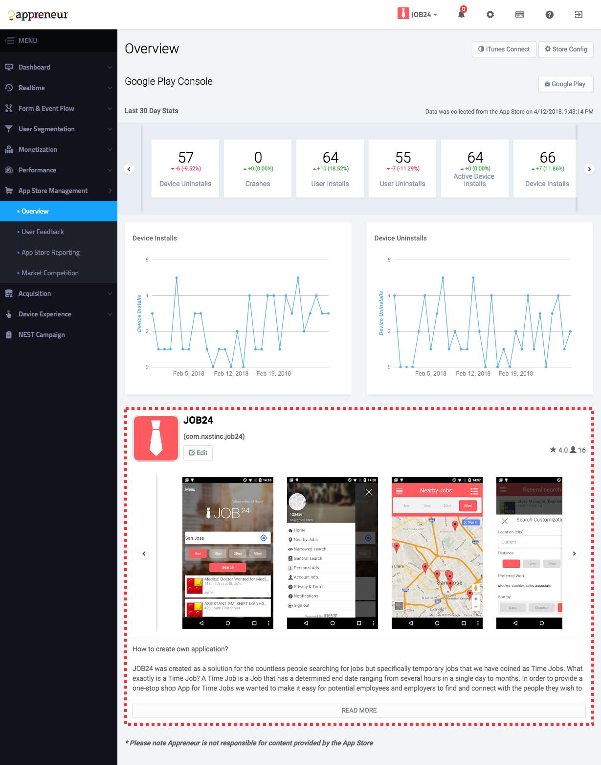
Feedback
All user reviews from the last app store data retrieval date can be viewed on this page. You can switch between platforms at the top right hand corner by clicking either “iTunes Connect” or “Google Play”. Reviews can be individually replied to on this form. Once a review has been replied to it can be re-edited by clicking “Update Reply”. Any response to a user review will be uploaded onto the store within 24 hours.
App Store Reporting
For the past 3 months (90 days) all install/uninstall/crash metrics are provided in greater detail by platform. This information is also segregated by day along with total counts. The metrics provided on this screen are directly reported from Google/Apple and may differ from the information seen in other sections of Appreneur.
The following definitions refer to Apple and Google’s store definitions:
- Google Play Store
- Device Installs : The unique total number of installs
- Device Uninstalls : The unique total number of uninstalls
- Crashes : Total number of crashes
- User Installs : The number of unique users who installed the app on one or more of their devices for the first time
- User Uninstalls : The number of unique users who uninstalled the app on one or more of their devices for the first time
- Active Device Installs : The number of devices that have been active in the previous 30 days and on which the application is currently installed.
- Total User Installs : The number of all users who installed the app on one or more of their devices for the first time. This number does not refer to the total number of devices. This number is the total number of google user accounts that have been installed.
- iTunes connect
- Installations : The total number of times your app has been installed on devices with iOS 8 or tvOS 9, or later. Redownloads on the same device, downloads to multiple devices sharing the same Apple ID, and Family Sharing installations are included. Totals are based on app users who agree to share their data with you.
- App Units : The number of first-time app downloads made on the App Store using iOS 8 or tvOS 9, or later. App updates, downloads from the same Apple ID onto other devices, and redownloads to the same device are not counted. Family Sharing downloads are included for free apps, but not for paid apps.
- Impressions : The number of times your app was viewed in the Featured, Categories, Top Charts, and Search sections of the App Store. Includes Product Page Views.
- Product Page Views : The number of times your app’s product page has been viewed on a device using iOS 8 or tvOS 9, or later. Includes views on the App Store and within apps that use the StoreKit API to load your app's product page.
- Sessions : The number of times the app has been used for at least two seconds. If the app is in the background and is later used again, that counts as another session. Totals are based on app users who agree to share their data with you.
- Active Devices : The number of devices with at least one session during the selected period. Based on devices running iOS 8 or tvOS 9, or later. Totals are based on app users who agree to share their data with you.
- Crashes : The total number of crashes.
- In-App Purchases : The number of first-time In-App Purchases on a device using iOS 8 or tvOS 9, or later. Restored In-App Purchases, whether on the same or different device, are not counted.
- Sales : The total amount billed to customers for purchasing apps, app bundles, and In-App Purchases. Taxes are only included in the sales if those taxes were included in the App Store price. Note that sales totals are not the same as your proceeds.
- Paying Users : The number of unique users, based on Apple ID, that paid for an app or an In-App Purchase.
Note that app store metrics may differ from the data provided by Appreneur (located on the other dashboards).
There are a few major differences that need to be specifically highlighted:
- Time Differences : Appreneur displays all app/user metrics in local time of the user device. The store consoles translate timestamp data into PST or PDT time formats. Thus, when viewing metrics such as install/uninstall count, data is always presented from the app owner’s perspective. Appreneur conversely presents timestamp information in the local time zone of the user device. This allows the app owner and user device to be synchronized over the overall app experience. For example, if a user device installs an app in India on 02/24/2018 at 06:30 am, Appreneur will log this install at exactly that time (02/24/2018 at 6:30 am) while the store console would display this install on 02/23/2018 at 17:00.
- App Store Policy : Appreneur will display install counts only if the app has been opened and interacted with. Thus, Appreneur data may be used to ensure consistency around what constitutes an app install. This eliminates any guesswork between what data major platforms (such as Google and Apple) are reporting regarding install counts. For example, if the app is installed and immediately uninstalled, then Google/Apple may or may not display this install for a number of reasons. Appreneur, on the other hand, will not show this install if the app has not been opened.
- Comprehensive Install Counts : App store metrics only reflect installs and downloads that originate from the app store marketplace. These metrics inherently do not include installs that are either directly deployed from a computer, from an external URL, or deployed through enterprise solutions. Appreneur ensures to count all of these install numbers.
- Location : There are many different methods for reporting location data (which proxy server to use, IP address, etc.). Thus there are small differences between what location a user device is downloading from between Apple and Google. Appreneur’s location data will also vary, particularly in Europe.
Market Competition
Appreneur provides a search tool for app owners to investigate competitive apps within the marketplace. You can compare your app to a specific app by clicking the Target App on the top right portion of the screen. This will provide a side by side analysis of all pertinent app market information such as reviews, rate, rank, install count, etc. Multiple apps can be compared by switching to All App and searching for each applicable app on the app store. Each app can be located through either App ID, App Name, or Search Keywords. A complete app search history is available by clicking the bookmark button located at the top left of the table. The overall market competition for your app can be quickly assessed through this comparison tool.
NEST Campaign
Create Campaign
The NEST platform provides free banner advertisements for both Mobile and PC. Over the past five years, over 3M Apps on over 100M mobile devices have been created through the NEST Platform. Appreneur users can target their ad campaigns to be displayed at the bottom of these apps as a banner.
There are many benefits for running an ad campaign through NEST:
- The Appreneur AI Bot analyzes data collected from your app users and automatically targets the region, device type, and OS.
- If you run your app for one month Appreneur has a minimum guarantee of 120k total impressions, with a 400 daily impression guarantee. The guarantee counts will be able to change by the NEST Ad Campaign Policy in future.
- Appreneur analyzes campaign data such CTR, New Install, and Status information to get detailed user device insights.
All of the following conditions must be met in order to create an ad campaign for free:
- You have collected at least 30 days of data from your app through the Appreneur service. Appreneur targets ad campaigns based on location, OS, device type, etc. This information needs to be analyzed prior to launching the ad campaigns.
- Your app is published on either the Google Play / Apple iTunes store. Banner ads are attributed through Linked URLs thus, Appreneur only supports policies that support public App Store connections.
Data required for creating ad campaigns:
- App Store : If you have already completed app registration and completed the configuration interface in the App Store Management section, Appreneur will automatically analyze your URL and register it within your campaign. If this connection has not been set up however, your campaign cannot be created.
- Background Color : You must select a background color for the banner layout when creating a campaign. We recommend selecting a color that matches your advertisement image.
- Banner Image : Within the NEST advertising space there are a wide range of pixel resolutions possible. To support all potential pixel images, please register all banner advertisements in every resolution. If you do not provide all advertising resolutions the banners will be randomly selected based on similar pixel dimensions.
NEST Campaign Reporting Board
Nest Campaign provides calendar based reporting information. All information shown by default reflects the historical data as of today’s date.
The following information is output based on the selected calendar date period:
- Engaged Device : The total number of devices installed via the NEST platform
- Ad Click : The total number of times a NEST ad has been clicked on by a user
- Ad Impression : The total number of times a banner ad was served to a user within the NEST platform
- Unique Click : The total number of unique clicks of a banner that was served through the NEST platform
- Unique Impression : The total number of unique banner ads served to a user within the NEST platform
- New Install : The total number of devices that have installed your app due to a NEST advertisement
You can monitor the progress of your NEST Ad Campaign through bar and line charts. The following information reflects advertising data based on the following criteria
All target data is automatically analyzed based on the information collected on the device.
- Audience : Appreneur determines where to place ads based on the Location, Device Type, and OS Type data that is automatically analyzed by Appreneur. The error range of Appreneur incorrectly placing an ad is 5%. An ad campaign can be targeted to both PC and mobile devices.
- Impression : The total number of times a banner ad was served to your audience. An impression is counted each time your ad is served on the NEST Ad audience network, such as an ad served on the NEST IDE or other NEST app. Impressions help you understand how many times your ad has been seen on NEST apps.
- Ad Click : The total number of times a NEST ad has been clicked on by a user whether it was on a banner ad (mobile) or PC ad.
- New Install : The total number of devices that have installed your app due to a NEST advertisement
- CTR : The total number of audience clicks divided by the total number of audience impressions. For Example, if your ad receives 5 clicks and 1000 impressions, then its CTR is 0.5%.
- Engaged Device : A device that has been determined to be Engaged after analyzing the device’s last one month usage pattern from installation date by the NEST campaign.
Let us look at a few points regarding NEST campaigns.
- Although all advertisements will be shown to users, there is the possibility that you may not receive the number of clicks, installs, or revenue you expect from your NEST Ad campaign. However, NEST will continue to work hard to deliver high impression volumes over time to all of our users.
- If your advertisement may be served to a location that is does not match the location of the app user -- there is likely a difference between the location information collected from the NEST user device and Appreneur. For example, the NEST IDE user device may show that the user is located in India in 2017 however this user may have moved to the US in 2018. Appreneur would treat this user as if he was located in the US, not India. For advertising purposes however, this user may still be treated as if he was located in India.
- NEST campaign impressions can be used to increase your overall app install count by raising the impression count limits.
Billing & Payment
Transactions
Displays the payment history, invoice files, and current payments to date. Payment is displayed among current balance, outstanding, and paid.
- Current Balance : The amount due based on today’s date.
- Outstanding Balance : The past due balance for invoices owed in arrears.
-
Amount Paid : A report that summarized the details of your payment. You may download the invoice for the report for all invoices paid.
- The settlement day will be settled on the first day of each month. If your service period is less than a month, the payment will be prorated based on the first day of the month. The settlement history can be found through the table chart history.
- The number of devices Appreneur will calculate the service is based upon the total number of devices accumulated during the settlement period. Uninstalled devices are included within the service charge because these devices have already been tracked and analyzed within Appreneur. Returning, Reactivated, and Dormant devices are also included since their information in continuously monitored and tracked as well.
The monthly payment plan is split across two options: a standard plan and a overage plan.
- Standard Plan : Up to 10,000 user devices managed by Appreneur @ $29 per month (not including tax)
- Overage Plan : $29 per month plus $0.01 for each user over 10,000. For example, an app with 15k user devices would be charged $29 + .01*5,000 = $79.
Invoice Item Description
- New Install Device : The total number of new devices during the payment month
- Uninstall Device : The total number of uninstalled devices (devices that have deleted the app) during the payment month
- Engaged Device : The total number of all Engaged devices during the payment month
- All Device : All user devices managed by appreneur until the last payment month
- Period : The calendar date period of the payment month
- Application : All apps registered within the Appreneur service console
- NEST Campaign Impression / Clicks : The total number of impressions / clicks your users have received during the time your ad has been served through NEST. The impression / click count will only be displayed for information applicable to the payment month.
- Tax : The tax amount applied from your service provider’s area (San Jose, California US)
- Total : The total cost paid during the payment month
Payment Methods
Appreneur will manage the payment methods you have submitted through our platform. Please note that only credit / debit payment methods are acceptable forms of payment. If you want to use another selected payment method (such as Bank Transfer or Check) please contact the support team. Let us look at a few points regarding payments.
- Within Appreneur you can manage a number of payment methods in one place. To keep your information completely secure, Appreneur does not store any credit or debit information on our server. We store only the secure token information for transaction from bank and provide you with the ability to update this information. If you wish to update the card number and card expiration date, please register a new card on this page
- When registering a new card you can control which card is set as the primary form of payment. Note that the first card registered will automatically be set at the primary card.
- If you cannot save your card information when registering a new card then we were unable to authenticate your card. Please validate your card information and resubmit.
- Do not worry if your card image is not displayed on the payment screen. Card images (or card brand symbols) may not be supported for all payment methods. These images are typically shown only for Visa and Mastercards. Other lesser known card brands likely carry unrecognized card symbols that are not supported.
- Appreneur will be automatically notified by the bank card issuer if the card is expired. If you are using an expired card you must immediately submit a new payment method.
Settings
You are able to manage account billing information.
- Payment Account ID : Your unique user ID used during the payment management. This ID is used when communicating with the Appreneur team to discuss your account.
- Business Name : Your company name.
- How You Pay : The Appreneur service automatically charges a service fee on the first day of the month. This field will show if you are paying automatically or through a special contract established with Appreneur.
- Payment Profile : This is the legally-registered business address that gets printed on invoices. This is different from the mailing address where invoices are sent, and which can be updated in the mail invoice delivery section of the payments account.
- Payment Contacts : Enter in the contact information for the person responsible for payment to Appreneur. Appreneur will contact this person to discuss payment related issues.
Configuration
Account
This is the primary account registered within Appreneur. All user device data is encrypted and stored within our system. If the Appreneur service is cancelled then all the data related to the account is erased.
- Account ID : The account ID used to login to the Appreneur service. This login is an email address and is unique to each account. Appreneur will contact this email in the event there any service related issues that have occurred.
- Status of Service : There are only two available options: Ongoing or Stop. This is the current status of your Appreneur service. If your service is listed as Stopped, please check your billing information and contact the Appreneur support team.
- Name and Address : The name and address of the person managing the primary account. Information related to the Appreneur account will be sent to this address so please ensure that the information is accurate.
- Phone Number : The phone number of the person who will provide feedback with Appreneur.
- Change Password : In order to change the account password you will need to enter both the current and existing password. If you cannot remember your old password you may locate it through the Find Password feature on the login page.
- Cancel Account : If you want to delete your account please make sure to visit our “Last Guide” checklist. If any problems or issues occur during your time using Appreneur please contact our support team immediately. Appreneur is a data service business that stores valuable information about your user devices. Once your Appreneur account is cancelled all data regarding your app is deleted and cannot be recovered. A final invoice will be emailed to you within 30 days.
Applications
The following procedures and information are required in order to register a new application within Appreneur:
- Application ID : This is either the Android package ID or iOS bundle ID. You must enter the Application ID you entered when registering your app within the app store.
- Title : The desired name of the app you want to use within the Appreneur service.
- Description : Enter a short description of your app along with key points you would like to highlight.
- Download App Config : Download and implement the config file by referring to the SDK Installation guide HERE . Appreneur will immediately analyze data collected from your app after the config file is successfully implemented.
You have no limit on the number of apps you can register in Appreneur. More than one app can be integrated and linked to your Appreneur account.
Your TIP! Before releasing your app
Please submit testing apps and live apps separately. It is highly recommended to submit a testing app along with a live app in a separate manner after completing Appreneur SDK installation and APIs integration into your app. This is for segregating test data from your actual data for future analysis.
Delete the test app after testing Once you are satisfied with the testing result of your test app, delete it immediately. It may be included in future bills.
Menu Configuration
Click the settings button → menu configuration tab to list all of the available menu options. You may enable or disable any of desired menus by clicking the toggle button for each. A list of submenus is available under each menu. By enabling or disabling each menu the whole submenu category will be affected however, you can individually disable each submenu without affecting the menu. Please note that the Acquisition overview menu is the only menu that cannot be disabled. This menu is the Appreneur landing page the user will view after logging in.
This feature can be used for below.
- The first month after the Appreneur SDK is integrated there will not be enough data for Appreneur to analyze user device behavior. During this time period some of the dashboards will not produce any data. Note that if the Appreneur SDK is not properly integrated certain data will not be collected. Thus the data for specific dashboards will continue to be shown as zeros. You may disable this menu within the menu configuration if this information is not useful.
- If the app developer has not integrated the Exception API into the app code then an Exception Error will not be reported within Appreneur. In this case, the Handled Exception menu will consistently output zeros. You may disable this menu within the menu configuration if this information is not useful.
Data Configuration
There are two ways to link data with other external systems such as the App Store configuration and Push configuration.
- Marketplace Store Configuration : One central repository to view and manage marketplace store information. This section allows you to edit (for Android only) the app store product page, review and reply to user reviews, monitor key app store statistics, and search competitive apps in the marketplace.
- Push Configuration : In order to utilize one of the key features (Uninstall Pattern Matching) within Appreneur please ensure that Push configurations are implemented. Appreneur analyzes user device data and produces device pattern analyses based on the past 90 days. Through this user device data, key insights such as uninstall patterns, device categories, etc. are available. In order to effectively analyze this information in real time, push configurations are required to check the install status of the device. If push configurations are enabled then Appreneur is immediately able to retrieve user device information. It is highly recommended to enable this feature in order to enjoy the full features of the Appreneur service. The push message used in Appreneur is used only to check the install status for the user device through a silent push message.
For push you can check the pattern data by inputting the Server Key push message (Android), Certification Profile, (.p12 file format) and Certification Profile password (iOS) in the Data Configuration screen. How to implement store configurations within Appreneur
Message
Appreneur will send system messages through the message console. This dashboard alerts all status information related to the Appreneur service. You may Disable / Enable the alert function by clicking the toggle button at the top right hand corner of the screen. You will communicate with group members through this message console and have the option to delete all message history. You will periodically receive information regarding your Appreneur service through this portal, please check for new messages to ensure stable service.
Group Members
This console allows you to create and manage user groups within Appreneur. The master account is the first user account who has signed up and registered for Appreneur. The master user can invite a maximum of four additional users to use the service. This invitation is sent to the users by email and must be authenticated. Invited users will have limited access to Appreneur features and will be unable to create Ad campaigns or register new apps within the console. However, these users will have access to monitor and submit changes related to error reporting on their apps.
There are 5 recommended user groups in Appreneur:
- Master : The person responsible for managing and analyzing the entire Appreneur data service
- Performance Management : The person responsible for monitoring and managing the Crash & Exception error statuses.
- Marketing Management : The person responsible for planning and executing the marketing strategy. This person will formulate various retention strategies and frequently use the NEST ad campaign tools.
- Development Management : The person responsible for managing and designating tasks to team members such as assigning errors to various developers as errors come in.
- User Activities Analysis : The person responsible for analyzing user device behavior patterns. This person will be making key decisions whether marketing campaigns will be focused more on retaining or acquiring new users after analyzing user device behavior patterns.
Video Tutorials
Walk through various Appreneur features with videos on both fundamental and advanced user analytics topics.

Acquisition - 9 different user device categories

App Store Management - Google Play & Apple App Store

Device Experience - Mobile App User Behaviors

Form & Event Flow - Uninstall Tracking and Engaged User Flow

User Segmentation - Mobile User CRM

Performance - Crash and Exception Management

Monetization - Revenue, LTV, and Churn

Dashboard - Custom Console